Friday 24 August 2012

My First PanPastel Card

Well I held out for a long time but I finally gave in and bought some PanPastels. I've seen so many gorgeous things created with them by my crafty friends that I had to have a go.

I followed a tutorial by the super talented Eileen Godwin.  Although it looks like a simple technique, it's a bit tricky to get the blending right.  I wasn't totally happy with my first attempt and it eventually ended up in the bin.  This is version 2.


I've a long way to go to get to Eileen's standard but I love the vibrant colours I ended up with.  I used the same colours as Eileen, Permanent Red, Phthalo Blue, and Diarylide Yellow.  By blending them together you also get lovely shades of orange, green, and purple.

I've finished it off with two sizes of Swirl stamps from Clarity and a greeting from Chocolate Baroque.  It's very different to the cards I normally make but I really like the simplicity of it.  I think you will be seeing more of these from me.

Tuesday 21 August 2012

Clarity Meadow Dance Stamps and My Blog Header

These aren't the sort of stamps I normally go for but there's just something about them that I love.  I was really pleased when I saw that I had them to make samples with for HSE 24.  The first thing I did was find out that the words meant "After the rain comes the sunshine".


I suppose it's a bit like the English "Every cloud has a silver lining".  

I decided to focus on the sun and make it a big, bright one!  I used Spiced Marmalade and Mustard Seed Distress Ink pads to create it and Tumbled Glass for the sky.  The corners are Spellbinders Persian Accents.


I also made a dinky little gatefold card.  It measures 5' x 5"when it's closed.  One of the Persian Motifs dies was perfect for a big sun on the front of the card.


Inside I made a bright Summery scene to go with the characters.  When I'd finished I thought it would be perfect for my blog header as it makes me smile whenever I look at it.  I'd like to be there with them.  Luckily I hadn't folded it so I was able to get a photo of it without the creases.  


Sunday 12 August 2012

Clarity Christmas Day and Night Stamps

These are the last of my samples from the August UK shows.  They are both using the new Christmas Day and Christmas Night stamps from Clarity.


I think the stamps are beautiful as they are, so for this one I kept it really simple.  I used Versamark ink and fine detail embossing powder in gold on Centura pearl card.  I heated it from underneath to keep the embossing as smooth as possible.  A couple of attempts ended up in the bin but I ended up with four that I was happy with.  Dodgy embossing would totally spoil a card like this!

I matted the embossed images onto some Bazzill card and added a matching ribbon to make it look like a parcel.  When rooting through my Clarity stamps I found the perfect stamp for the tag.  I think it finishes it off perfectly.


I do love different cards and this one was my favourite of the samples I made this month.  That probably explains why there are so many photos of it!


It's a picture flip card and I found a couple of demos for them on YouTube.  I just adjusted the measurements to fit the stamps.  


I made a mask and brayered through it for the sky.  Then added glitter to the snow on the trees.  The cross is coloured in with a gold gel pen.  The snowflakes along the side are done with a Martha Stewart punch and the tag is another Clarity stamp.


For the Night stamp I just coloured in the starts with Distress Ink on a Cut-N-Dry nib and added glitter to the trees.


I've added a video as these sort of cards look so much better in action.  Hubby is doing the modelling, I think he could be after a job on a game show!  


Wednesday 8 August 2012

Clarity Dove and Noel Stamps

The Dove Panel is a really intricate stamp.  When you first look at it, it looks like a beautiful swirly pattern.  It's only when you look closer that you see the doves.


The first thing I did was stamp the image onto some scrap paper and look for all the doves.  I coloured them in (very roughly) so that I could see where they all were.  I had a few one winged ones to start off with but I eventually realised that they all have two visible wings.  So that's my top tip for this stamp - check that all your doves have two wings!  :-)


For my first card I used them as they were intended and made a bright blue Christmas card.  I stamped the image onto some white card then cut out little masks of all the doves.  This took a while!  I then masked off the two panels and got out my Splodge Away mat.  I brayered over them with Kaleidacolor Blue Breeze.  For the co-ordinating mat I used a sponge and randomly applied the different blues to the card.  It was looking a bit bare, so I added a couple of decoupaged blue doves to finish it off.


For my second card I decided to use the doves to make a wedding card.  It's done with Centura Pearl  card in Snow White and matted onto gold mirri.  The colour I've added is from a Distress Ink pad in Antique Linen.  I used some Cut-n-Dry foam to apply it to the centre strip, then I used a Cuttlebug Swiss Dots embossing folder to give it some texture.  Cut-n-Dry nibs were used to apply the colour to the doves and church.

I just couldn't get a decent photo of it so I've added a couple.  One shows off the detail better, the other the embossing.   I need to improve my photography skills!


Monday 6 August 2012

'Twas the Night Before Christmas Clarity Stamps

I love this set of stamps and was very pleased to be able to make some samples with them.


This card is very simple but it's one of my favourites from this month.  It's a theatre card and I got the idea from my Everyone Needs a Hougie 2 book.  I love my Hougie board.  I used the wood effect card as I wanted it to look like a mouse hole in a skirting board.


It's just two pieces of card with a couple of score lines at each edge.  You can cut whatever shape aperture you want in the front.  Simples!


This one is my Mum's favourite.  Again it's very simple but the Angelina Fibres and Film really enhance it.


I used black Archival ink to stamp the image onto the film for the shoe.  The background is just two pieces of film with some fibres in-between.  I heated them with an iron to fuse them together, then I cut it out with a Nestabilities die.

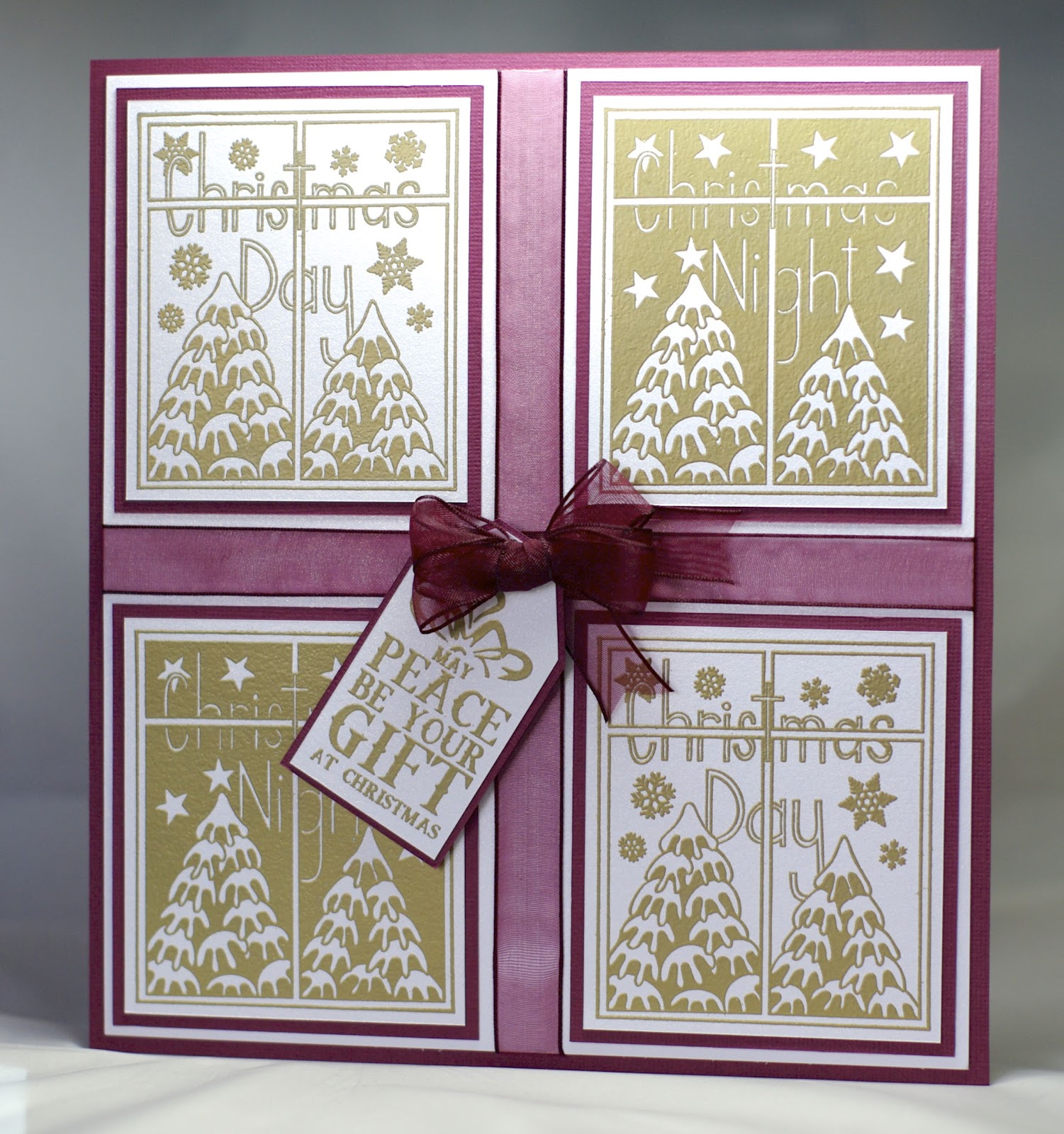
I am lucky enough to have the whole set of these stamps and these are a couple of cards that I have  previously made with them.


I love making these folded books and had to make one with these stamps.  This one was made for my Mum and Dad.  It was before I got into Spellbinders and ProMarkers!


This one was post ProMarkers and Nestabilities, although I've still used my Sakura Stardust pens on parts of them.  I do love a bit of sparkle, especially on Christmas cards.  My Hubby was the recipient of this one, so I get to enjoy it too.  It comes out again every year.

There are three more stamps in the collection since I made the last two books.  I really need to make something new with the whole set.  This time I will try and do something that I can add to when new stamps come out, like the gorgeous wall hanging that Dee Paramour made.  The K&Co papers that I used were perfect at the time but I don't have enough left to add to it.  A wall hanging will also be easier to display.  I don't suppose it will get made in time for this Christmas though.  I haven't even started my Christmas cards!

I wonder if Barbara has created any new stamps in the collection for this year?  I do hope so.


Saturday 4 August 2012

In the Classroom with Barbara Gray - Lesson 10

This morning was my UK debut as a member of the Clarity design team.  It also turned out to be my Dad's TV debut!


My parents were staying with me when I was doing the samples and Dad took his monochrome card to Doncaster to show Barbara.  He was very pleased to see it on telly.  His name's Brian, but it amused me to hear him being called "Lynne's Dad".  :-D


This is the first one of mine using the birdcage stamps from Lesson 10.  They are gorgeous stamps and were a lot of fun to work with.

I used the branch from the Kingfisher set and added the leaf from the Birdcage set.  I embossed the cage in gold to make it look like a gilt one.  I added a couple of shades of green and some orange to the stamp to give the lovebirds a realistic colour.  It was my first attempt at the clouds, but I was really pleased with how they turned out.  I think they will be appearing a lot from now on.


The second one started off as a pink and purple card.  I used Distress Inkpads to colour and stamp the background.  The musical notes are from Lesson 4, the Joy set.  When I started colouring the birds I decided it needed some more colour, so I added the green.  I think it really brightened up the card. 

I hope you like my cards.  It was very strange seeing them on TV alongside the fantastic Clarity Design Team.  I'm still finding it hard to believe that I am now one of them.


Wednesday 1 August 2012

Scarecrow and Poppies


This card uses some of my favourite Clarity stamps, the Scarecrow, Poppies, and What Is This Life.  I think What Is This Life is probably my most used Clarity verse stamp.  It just seems perfect for so many cards.


I also used my new Splodge Away Mat.  I'm so impressed with it.  I brayered the grass using a Lettuce Adirondack ink pad.  As you can see it went on really smoothly, with no lines!

The sky and sun were done with Distress ink pads.  I used Tumbled Glass with an ink duster for the sky and Spiced Marmalade and Mustard Seed on a sponge for the sun.  That is also how I did my new blog header.  More on that at a later date, as it's actually a sneak peak at a sample I've done for HSE 24.

The poppies were coloured in with ProMarkers.  I must say colouring is growing on me and I rather enjoyed that part.

The scarecrow's jacket started off as a piece of patterned paper that looked like hessian.  I added some colour with ProMarkers and then added some Walnut Stain Distress Ink.  I thought he'd probably look a bit distressed after standing out in a field all day.


Related Posts Plugin for WordPress, Blogger...